

January 30, 2016
DIY: Fake Calligraphy for Addressing Invitations
Calligraphy and hand-lettering is an artistic medium rising in popularity, which might surprise you, considering that cursive is rarely even taught in schools anymore! However, the art of creating script-like font is nowhere near becoming a dead art. Actually, it is becoming a staple look in the field of fine art photography to have not only an invitation suite in calligraphy, but cohesive font on name cards, menu cards, and on envelopes to addressees as well! Adding calligraphy to any of your wedding stationery can add a look of finesse and class–and also makes things look more expensive than they are.
 However, hiring a calligrapher for your wedding can be very expensive! Can’t find any wiggle room in your budget for a hand lettering artist? Good news! It is possible to create your own calligraphy–and yes, even if you have terrible handwriting! I have created a tutorial on how I “faked” calligraphy for our wedding invitation envelopes that we sent to our guests! And if you have every seen my handwriting (super crazy, super messy, super anti-calligraphy-esque), then you will believe that you can do this too!
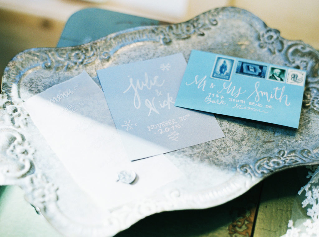
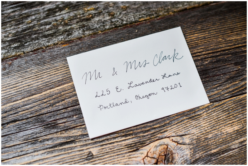
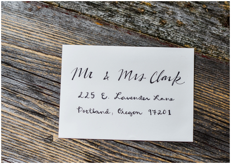
This image here, taken by Cassidy Brooke Photography, shows one of the envelopes I did “fake calligraphy” on for our wedding!
How to get started…
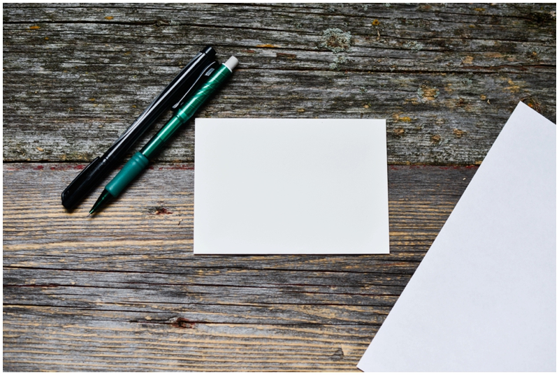
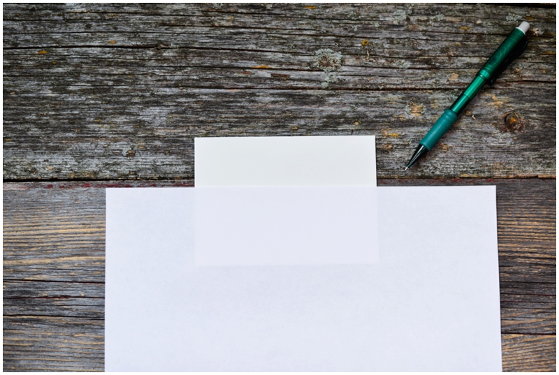
Supplies: a pencil, envelopes, gel or ink pens, and scratch paper–that’s it!
Tips and tricks…
- ENVELOPES. Choose envelopes that are not satin or shiny in texture, as the ink might not apply well to these. Any color of envelope will work, but first consider what color of ink you intend to use…
- INK COLOR. White ink will show up best on dark or bright colors; the same goes for silver and usually gold. If your envelopes are lighter in color, think about something darker, like black, blue, or dark purple.
- YOUR PEN. Now that you know what color of ink you want to use, you can choose your fake calligraphy tool! Personally, I love gel pens for this project. I would advise to opt for a more expensive gel pen though that works really well. They will put out a thicker color! Make sure to buy more than one; depending on how many invites you have, you very well may run out of ink. Another good option is a fine tip ink pen. In my example pictures here I am using a black sharpie pen. I like using sharpie pens because they dry fast and you can write over pencil with them and erase the pencil marks so easily this way. With gel pens this is harder!
- GRAB A PIECE OF PAPER THAT IS NOT THE SAME COLOR AS YOUR ENVELOPE. This is a trick I use to keep my lines straight. The paper gives you a straight line to write above and therefore helps you to not write crooked!
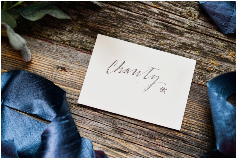
- LET IT COME NATURALLY. When I first did this project, I noticed that most times my fake calligraphy looked best when I didn’t think too hard and just curved my letters in whatever form felt right. What feels natural might be what looks best. Practice on scratch paper before you write on the envelopes to figure out your style!
- MAKE IT LEGIBLE. I remember when I showed my fiancé (now hubby) the calligraphy on our invitation envelopes… His eyes got big, and then squinted as he tried to read my cursive. “Will the mailman know what that says?” Even though the super scripty, artistic font looks beautiful and romantic, you do want to be legible! Here’s what I figured out: for the addressee’s name, go crazy. Curve and curl and do little loopedy loops. But on their actual address, opt for something normal and very legible. It would be terrible to put all this work into your fake calligraphy only to hear that none of your recipients ever got their invitation!
 Now that you have your supplies ready, here’s the how-to…
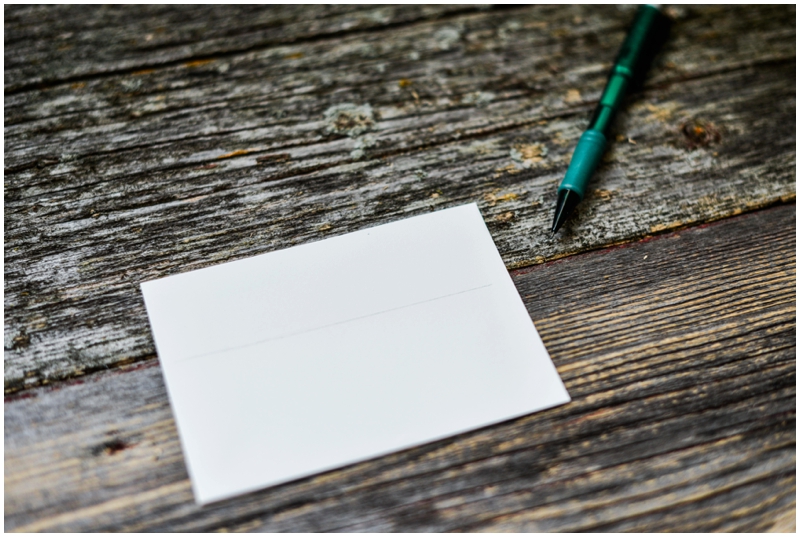
1) Start off by taking that piece of paper and laying it flat on your envelope. Line up the long, straight edge of the paper where you want your first line of your addressee’s info to be. Take the pencil and every so lightly draw a line across that edge. This is what will guide you when writing out your addressee’s name. You will erase it later, no worries!
2) Grab your pen and get it nice and ink’ed up (if it’s a gel pen) by rolling it on some scratch paper until the ink is flowing smoothly. At this point, you might want to practice some letters to figure out how you want to write out the addressee’s name.
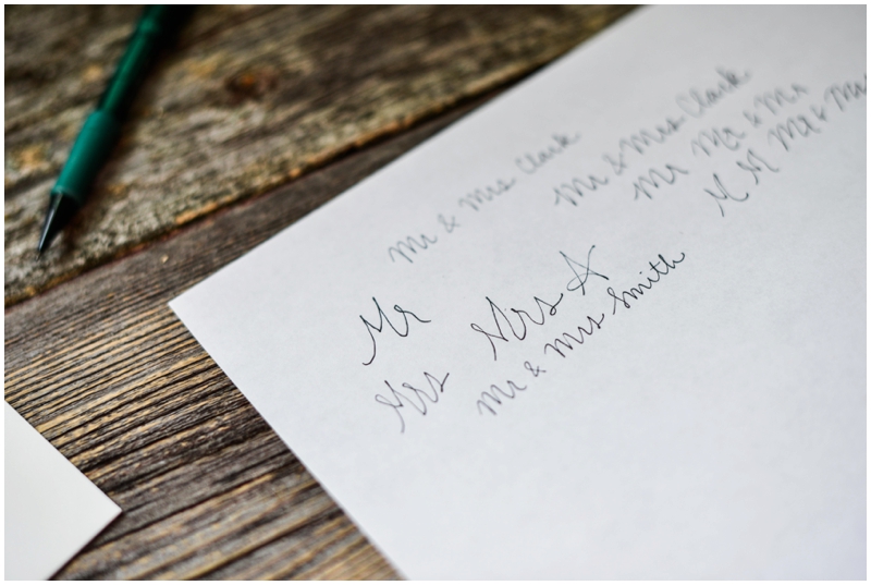 3) Think about how long this addressee’s name is. Is it super long? Start farther to the left of the envelope. Pretty short? Go more towards this middle. Don’t freak out if you start too far to the left or the right. The nice thing about this style of “calligraphy” is that you can make some letters bigger or smaller to compensate and it can still look great!
 4) In simple one-line cursive, write out the recipient’s name. For a formal invitation, I usually do “Mr & Mrs Last Name” or “Miss Jane Doe.”
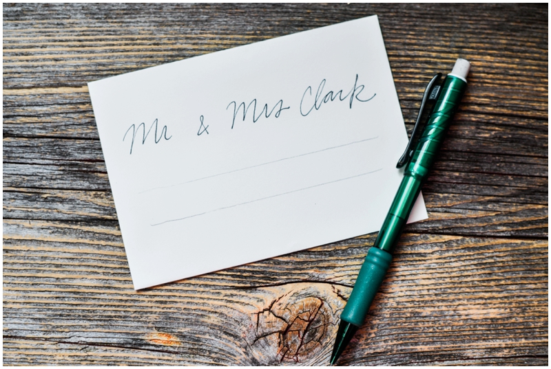 5) Great! You have your first line done! Go ahead and erase any pencil marks. Before getting into the detail work of that line, write out the address information. Be careful to not smudge what you just did; gel pens can take a few minutes to dry. Take that piece of scrap paper again and draw a shorter line below the first for the first part of the address, and another one about an inch or so below that line for the state and zip code. Make sure the address is legible.
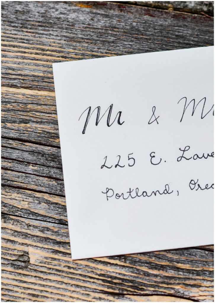
 6) Beautiful! Now comes the “fake calligraphy” part. I know very, very little about real calligraphy, but here is what I do know: on down strokes (parts of the letter where you pushed downwards) you want the line to be thicker, and on upstrokes (parts of the letter where you pushed upwards) you want the line to be lighter. This right here is your fake calligraphy trick: Anywhere where you did a downstroke, take your pen and make that line thicker by adding more ink to one side of the line. That’s it! By making these lines thicker, the upstrokes automatically look lighter–and overall, it just looks more fancy and like you worked harder than you actually did.
Make sure to let your fake calligraphy dry, and get started on the next invite!

get to know us
We're Shelby & Jared, Springfield MO wedding photographers passionate about meaningful living. We document timeless moments for free-spirited, elegant couples across the Midwest and beyond. As fine art photographers, we strive to create work that will leave a legacy of love for years to come.
MEET SHELBY & JARED
Springfield, MO wedding photographers
Have a beautiful vision in mind for your wedding day but not sure how to make it happen? Our guide will walk you through how to create the perfect wedding day timeline that will let you focus on the memories and have a worry-free day! Enter your email below for your free guide!
YOUR Guide to a Stress-Free Wedding Day Timeline
FREE guide

